


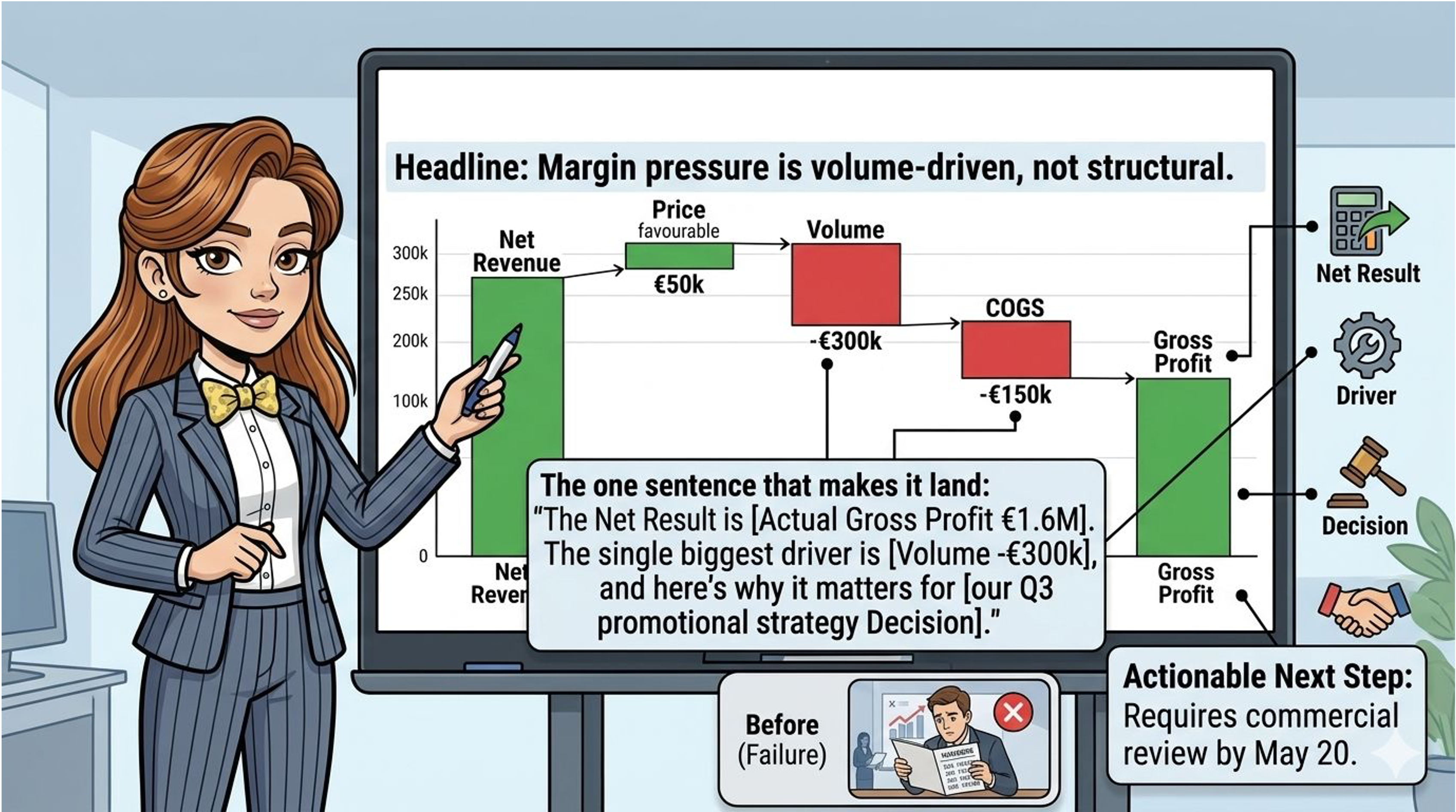
You’ve built the bridge chart. Every bar is correct. The maths reconciles perfectly. You put it on the screen.
Then you watch the CFO’s eyes scan left to right, squinting slightly. The COO leans forward. Someone asks “sorry — which of these is the biggest issue?” Someone else asks “is this good or bad compared to last year?”
You know the answers. You built the thing. But the fact that the room is asking those questions means the chart has failed at its primary job — which is not to show the numbers, but to make the conclusion obvious before anyone has to ask.
This is the gap between a chart that reports and a chart that convinces. And it lives entirely in how the chart is set up, labelled, and narrated — not in the numbers themselves.
Why the waterfall chart is uniquely powerful — and uniquely misused
No other standard finance visual does what the bridge chart does: it shows causality. Not just where you ended up, but how you got there, and which forces drove the movement. That is exactly the information executives need to make decisions.
But most bridge charts in practice are built for accuracy, not communication. They’re technically correct. Every bar ties out. The totals foot. And they communicate almost nothing to someone who didn’t build them.
The problem is structural. Bridge charts carry three layers of information — the starting point, the movements, and the ending point — but most teams only label two of them clearly. The movements — the bars in the middle — are left to speak for themselves. They don’t.
The four-layer annotation framework
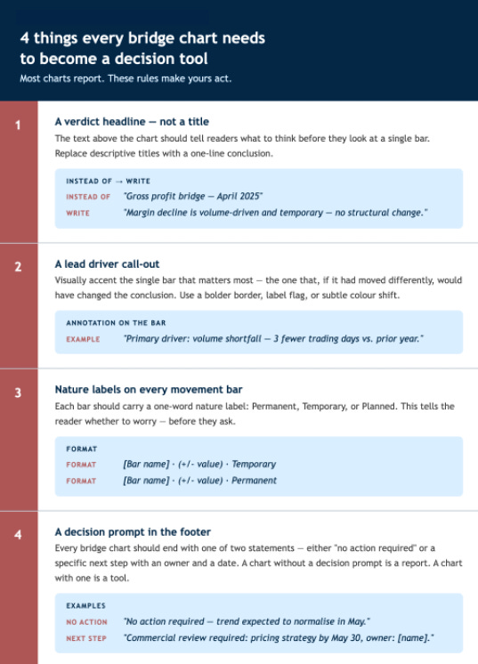
A bridge chart that drives decisions needs four things that most charts are missing:
Before and after: the same chart, two completely different conversations
The numbers below are identical in both versions. What changes is everything around them.

The numbers are identical. In the “before” version, the room asks three questions and someone requests a follow-up. In the “after” version, the room reads the headline, glances at the “Lead” flag on volume, sees “Temporary,” reads the footer, and moves on. Decision made in 90 seconds.
That’s not a different analysis. That’s a different standard of communication.
The narration sentence — say this out loud
Even with a perfectly annotated chart, the moment you put it on the screen you need to say something. Most people narrate the bars. Don’t.
Use this template instead — every time, without exception:
“The net movement is [direction + amount]. The single biggest driver is [named bar] — and it’s [permanent / temporary / planned], which means [implication for what the business should do or not do].”
That sentence takes eight seconds to say. It answers the three questions every executive is silently asking — how much, why, and should I act — before they have to ask them.
Practise it. It feels unnatural at first because it forces you to have an opinion, not just a summary. That discomfort is the point. Finance’s job is to have an opinion, not to describe the data and wait for someone else to form one.
The one rule that changes everything
If your bridge chart could exist without a headline — if you could remove the title and the chart would still “make sense” — it isn’t doing its job.
Every bridge chart should carry a headline that would be false if the numbers were different. That’s how you know the headline is doing real work, not just decorating the visual.
“Gross profit bridge — April” is always true. It describes the chart regardless of what the numbers show.
“Volume shortfall offset by pricing strength — margin stable” is only true if that’s what actually happened. It can be wrong. Which means it can also be right. And being specifically right is what moves a room.
This week’s action
Pull up your last bridge chart. Read the title. Ask yourself: could this title have been written before I ran the numbers?
If yes — rewrite it. One sentence. Make a claim the data either proves or disproves. That’s your new standard for every bridge chart from here on.
Join my newsletter for more finance content!